Friday 28 September 2012

Research and Planning: Shot Types

For this task, we were asked to look at the different shot types that are in the Media and then re-create them
in a small rectangle box at the side of the sheet. The first shot that we were asked to re-create was the Establishing shot, which is a shot which sets the scene of the programme/film/documentary or any type of Media. The shot is mostly just of the Village where a programme is set etc. For example, the Establishing shot of the Soap Opera Coronation Street is the shots of the Town and streets. The next shot was a Close-Up which is a shot of the character or person's face and nothing else. The next was a Mid Shot, which is a shot of the person's hips and up, and nothing else, which includes not showing any legs or other part of the body. The next was a Long Shot, which is a shot of the person's whole body. A Two-Shot is a shot of two characters in the same scene. The POV shot was a difficult shot to portray in a diagram, however in the end I drew two eyes with the scene in the middle of the iris'. The POV Shot is when the camera seems like it is inside the Character's eyes and it is from their view, as if you are that Character looking at someone. The Aerial Shot is when a scene is shot from above, like it is obviously shot from a Helicopter or Plane, simply just a shot from above. An Over the Shoulder Shot is a shot from behind a Character's shoulder, looking over at the scene that they are looking at. The last two shots were a Master Shot and a Wide Shot. The Master Shot is the classic shot that nearly ever scene comes back to in a programme, as it shows the whole scene in one. The Wide Shot is simply a Landscape shot of a scene.

Research and Planning: College Magazine Evaluation

How did I create my College Magazine?
Evaluation

I started off my creation by doing the Cover page on Photoshop. I tried to stay true to my cover page draft, however I had to move a few things around so that it all fit nicely onto the page. One of the main things that I had to change was the colour scheme, as the image that I used for the background of the cover page was very dark, therefore I had to change the Masthead font colour to white so that the viewer would be able to see what the magazine is called. I think that the colour change makes the magazine stand out more, which was a good decision. Also, I moved the cover lines to the right hand side of the cover page, as the main image of the girl was set to the left and I didn't want any font to cover over her too much. For the main image, I also stayed true to the brief, which was to have a medium close up, which means from the middle up, showing no leg. For the Contents page, I made sure that the colour scheme was the same as the Cover page, so that the whole magazine shared the same house style, making them match and look like they are from the same magazine. Also I had to go out into the college to take some pictures that were relevant and appropriate for my magazine, therefore I took pictures from the inside main hall and outside the college. I would have liked to add more stories to the Cover page, however to make up for this I added many different College related stories to the Contents page. I had to make sure that all the stories were applicable to the magazine or it would have not appealed to my audience. All in all, I think that the creation of my College Magazine went to plan, and I am pleased with the overall finish of the whole thing.


Research and Planning: College Magazine


The finished product for my College Magazine.


Research and Planning: Pictures for College Magazine


Tuesday 18 September 2012

Research and Planning: College Magazine Drafts

 Before the creation of my College Magazine I had to make sure that I knew what I was creating and wouldn't mess up the final piece, also these were the pieces that I was showing my audience who I was interviewing.
I made sure that I was going to stick to the three colour rule, and I decided to choose black, red and orange. However on the actual final College Magazine piece, I had to change the black to white as my image that I used on the front cover was too dark so the black Masthead did not stand out, and the Masthead is the most important part of my magazine.
For the Masthead, I created a sort of Times New Roman font, as this is a font that is associated with school and college, and therefore fits the demographic that I am aiming for. However, I wrote 'Custodian' in a different font to give the magazine a more dynamic look, and to make it look more interesting.

Research and Planning: College Magazine Draft Feedback


For another activity, we had to create a mock up magazine cover of what our college magazine would be, then, because we need feedback, we went out and asked our demographic, which is college students, what they thought of my magazine. I asked three people in total and each person gave different answers which gave me a better understanding of what they will be looking for in a magazine and what they would like to see.

Interviewee One:
She said that she would like to see information and pictures in the magazine.
She also said that she would not pay for a college magazine and nothing would change her mind, this tells me that I would need to make my college magazine free or a lot of my target audience would not buy it.
The thing that she would most look for in a college magazine would be facts and information.

Interviewee Two:
She said that she would like to see information in a college magazine.
She also agreed with the first interviewee that she would not pay for a college magazine.
She said that the content she would like to see the most in information about the college, classes and whatever clubs that the college offered.
She said she would most like to see a student as the main image because you would be able to relate to the magazine more.

Interviewee Three:
Interviewee three said that she would most like to see courses in the college magazine.
She said that she would not pay for a college magazine, however if there was free stuff involved than she would reconsider.
She said that she would most like to see case studies in a college magazine.
She also said that she would most like to see a student as the main image because "everyone knows the teachers but being able to know what a student does would compel you to read the magazine.

 During the creation of my college magazine I will be taking all of this feedback into consideration as what the demographic wants is my first priority. And if I follow the feedback, people would be more likely to read, buy or view my magazine.

Research and Planning: Audience Interview Questions


Questions:
What do you look for in a College Magazine?
Would you pay for a College Magazine?
If no, what would make you pay?
Would you rather have a Teacher or a Student as the main image?
What type of content would you want in a College Magazine?
Do you think the Magazine should be published weekly or fortnightly?

I chose to ask these questions because I knew that they would be the most successful in finding out what my demographic wants and will eventually help in the creation of my College Magazine.

Research and Planning: Semiotics

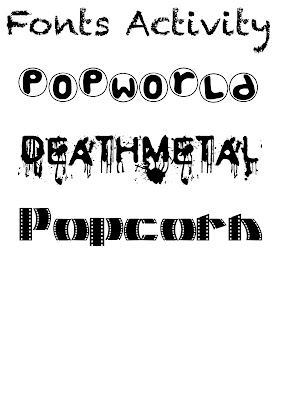
Our next lesson in Media Studies AS was again in Photoshop, only this time we were learning about fonts, semiotics and the different effects of different fonts. We were given three titles, Popworld, Death Metal and Popcorn, and for these we had to find three different semiotics which would match the words. To complete this, we went onto a website called DaFont which has a collection of different fonts. We searched for key words and eventually found the fonts that we wanted, we then downloaded the font onto Photoshop and wrote out the title. This activity was important as we had to learn what different effects different fonts have on readers so that when we come to create our end product music magazine we will be able to make sure that the Masthead is the correct font for the demographic.

Wednesday 12 September 2012

Research and Planning: Medium Close Ups


I understand that these are the type of shots that I will be using when creating my own College Magazine. These are called medium-close ups because they are just of the head and the shoulder area.  If I would have been asked to do a long shot then you would have been able to see their whole body including feet and head.


Tuesday 11 September 2012

Research and Planning: College Magazine Analysis

For our next task we were asked to begin the analysis of a College Magazine. I can tell straight away that this is a college magazine because of the Masthead 'College'. This is a very simple and blunt way to tell its demographic group what type of magazine it is they are about to read. The magazine has all the stereotypical aspects of a magazine, a main image, cover lines, publication lines etc. I can also tell that it is a College magazine because of the way the girl is dressed, the conventional baseball t-shirt gives it away. However it could also suggest that it is an American College which would be the equivalent to our Universities; she also looks too old to be going to a Sixth Form College 16-18. Another thing that give away the fact that it is a College Magazine is the cover-lines, which include gossip topics about the college

Research and Planning: In Design Tutorial

Today, I was introduced to a programme called InDesign, Adobe. It is a good programme which is used for magazine and newspaper creation. We started off by opening inDesign with an A4 page and then searching the internet on Empire (A Film Magazine) for film reviews. In the end, I chose the newly out Brave. We had to copy the review, put it in a word document and then save it on our Desktop.

Research and Planning: Photoshop Challenge

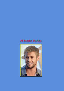
As my fourth try at Photoshop, we were presented with a 'Photoshop Challenge'. There was a list of challenges that we were to complete. The first one was to open up an A4 document, which was simple as 'File' and 'New...' were not new functions to me. The next thing we were asked to do was to create text that says 'As Media Studies' in a Century Gothic size 24 font. This, again, was simple as I am used to these kind of functions from years of using Microsoft Word. I then had to change the colour to red by highlighting the text, and choosing the colour that I wanted. I was then asked to move the text to the middle of the page. I then had to change the colour of the background. By doing this, I used a tool at the bottom of the layers box called 'Adjust Layer', then I chose 'Solid Colour' and I was asked to change it to blue, so I did. After this we were asked to highlight the text and give it a drop shadow. I did this by again highlighting the text and then chose 'Layer' and then 'Layer Style' and then chose the Drop Shadow tool. I was then asked to find a picture on the Internet, which I did and then drag it into the image underneath the text. After, I was asked to change his hair colour. After the other Photoshop Challenge of adjusting the girl, I had already changed someones hair so I used the same tools as I did on the other one, the pen tool with a low Opacity. The last thing I was asked to do was to add a border, I did this by using the 'Stroke' tool.

Research and Planning: Skin Tutorial

On my third day of the introduction to Photoshop, we were doing an airbrushing and skin tutorial. I started off by using the Spot Healing Tool Brush to get rid of any blemishes that she had. We had to make sure that our tool was the right size for the blemish or the skin would go distorted. Following this, I wanted to create a softer look for her skin as it was quite shiny, so I used the Smart Blur tool and changed the Opacity of the layer to make sure that she did not have a cartoon look about her. After this, I wanted to change her blonde hair to something more darker so I used the Paint Brush tool, changing the colour to a dark brown, and making sure that the Opacity was down so that I didn't have a block effect, I changed her hair to a more dark brown. After this I used the brush tool again to give her some subtle blue eyeshadow, some mascara and to change the colour of her lips to a more red colour giving the effect of lipstick. The last thing that I did was give her some blush, I did this by making the paint brush a larger size and then moved the Opacity right down to about 16%, choosing the right colour I gently brushed her cheeks to make it look like blusher.

Research and Planning: Film Poster


For my second chance at trying to decipher how to work Photoshop, we were asked to create our own Film Poster. We were asked to choose a film, any film, and get a poster or image of that film. We would then take a picture of ourselves or of a different celebrity and change the face on the original image. For mine, I chose to do Lord of the Rings. For this, my friend Lois and I took pictures of our faces using the Photobooth application, we tried to match the expression that was on the original poster. Then, we had to open up Photoshop and add all of our images, the Lord of the Rings poster, Lois' picture and my own. Using the Lasso tool on Photoshop, I started to cut around mine and Lois' faces, however seeing that this is a challenge for my unsteady hand to just cut around the edges of our faces, I instead cut out our features. This seemed to work too and the poster gained a humorous edge.

Research and Planning: Photoshop Tutorial

For my first proper use of Photoshop, I think it went pretty well. We started off by changing the marquee tool to the Elliptical setting, to make sure that our CD was a perfect circle. Following this we proceeded to cut out the CD to place onto our musical note background. After doing this, we used the "Colour Balance" that you can find within the Filter tab, we changed the colours to whatever colour that we wanted. I chose this colour because it is my favourite. We then used the Magic Wand tool to select the background on the horn image, then proceeding to revert to make sure that only the horn was selected, we then moved that onto our background as well, arranging them both to our own tastes. Then whilst looking at the layers, we found that one was hidden, after this we pressed the little square which brought up an image of an eye, which meant that the layer was now visible. It was an image of some music notes but I decided not to use it because I thought that my CD Cover was good enough as it was. To finish it off I added my own name in a fancy calligraphy to make it look professional.