Wednesday 30 January 2013

Research and Planning: Cover Change


 Something that I have come to notice with Kerrang! magazine covers is that they are not afraid to add things going up the side of the magazine into the main focal image, making the cover look busy and overloaded, following the conventions of what rock music is about. I want to do this for my magazine, make it look busy. Therefore I have decided to change the style of the front cover to have the 'poster special' section running up the side next to my model. I think this is a good change to make as before it looked too empty to be compared next to a Kerrang! magazine.


Research and Planning: Magazine Progress #10


Research and Planning: Magazine Progress #9


Monday 28 January 2013

Research and Planning: Magazine Progress #8


As a second design, the front cover band logo 'Lisha' seemed to be proving difficult, so I am trying out taking off the little curl on the L to make it fit in the small section, this is not a definite change but just a different idea.

Research and Planning: Editor's Note

 
When researching on Contents pages, I found that most of the Kerrang! magazines have a small part in the corner where the Editor adds his/her own little bit, writing about the focal point of the magazine and what the reader will find within. For this I wrote a small paragraph about the Interview with the band Lisha and which page they could find this on.
Also I noticed that the Editor always has a signature, obviously, and if my Editor was to not to this then it would be not following the magazine rule, therefore I searched on the internet for a suitable signature-looking font and found Mans Greback's font Signerica Fat was perfect, making my editor 'Delilah' look even more realistic.

Research and Planning: 10 Minute iShowU


Monday 14 January 2013

Research and Planning: All Shots from Outdoor Shoot


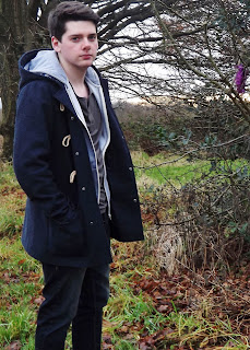
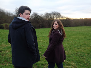
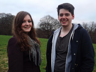
Again with this outdoor shoot there are many pictures, a lot to annotate individually, however I think that the shoot went well but a lot of the pictures either had bad lighting, or one of the model's faces wasn't smiling etc. I think that the location was perfect for what I wanted because it made a nice backdrop but wasn't too fancy as to take the attention away from my models. 

Sunday 13 January 2013

Research and Planning: Best Images from Shoot

1

 2

4
3

5
6
7
Overall I think that the shoot was successful in capturing the right images to grace the double page spread of my magazine. By dressing them in dark clothes I think it really compliments the magazine and what it is about, also the straight faces with just a few smiles from Elisha really set the image of Jack as the 'moody guitar guy' which I really wanted from them. I think that the surrounding was perfect, as it was Winter the trees were bare and I think this gave the shoot an eerie feel.

8

9