Thursday 21 March 2013

Evaluation Question Seven: Looking back at your Preliminary Task what do you feel you have learnt in the progression from it to the full Product?


In this video, I will be talking about the differences between my College Magazine which was created in September/October 2012 and the Music Magazine which was finished in February 2013. There are many differences between the two magazines. (In the video I stated that it was Evaluation Question Six, whereas it was Question Seven. Apologies).
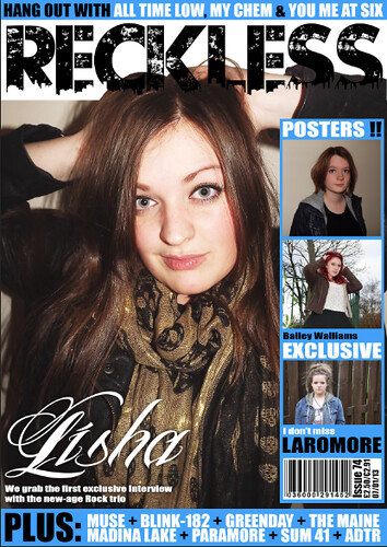
As you can see the layout of the two is completely different from each other on the Front Cover, as come September I had never had such a full use of photoshop in my life, only messed around on it and seen what I can do. Whereas when creating the Music Magazine I knew what I was doing and I learnt new skills along the way and how to do certain things. The layout for the College Magazine is messy, everything seems kind of thrown around, and you can't see the Masthead as the colours from the image blend in with it, making it difficult to be able to read what it actually says whereas on the Music Magazine the Masthead has a white background to make it stand out so that you can see it clearly, because the name of the magazine is a pretty important part. The image for the college magazine is very blurry and right down in the corner, making it not the focal point of the magazine whereas it should be. When creating the College Magazine I had no concept of what sizes the fonts should be, so as you can see all of the fonts on the page are near enough the same size, again casting away the Masthead as not as important as the rest of the magazine.

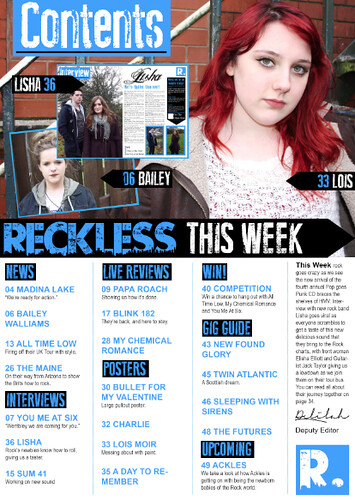
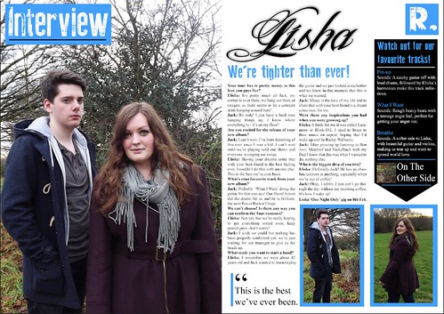
When considering the Contents, there are many different things about the two, I think the contents for the College Magazine is even worse than the Cover. Although I did keep with the colour scheme of the orange, red and white, I think there is too much of an overload of colour to the right hand side, it makes it look unrealistic. Also I think that it is very hard to be able to read the sections on the College Magazine contents, as on the Music Magazine there is clear sections, subheadings which categorize the stories in the magazine in the appropriate slots so that you are able to quickly find what you wanted to read and go to it, whereas on the College Magazine there is just a block of writing. Also I really don't like the way it says 'Page' for the page numbers, as you can see on the Music Magazine I did not write page, but just indicated at the number, I also don't like the '3-5' with the hyphen, the readers don't have to know what page the article finishes on, just where it starts. Another massive difference between the two is that I made the College Contents on InDesign whereas I think that my skill really lies within Photoshop which is why I did not do the same for the Music Magazine, and instead did that in Photoshop. The pictures on the College Contents also have no real relevance, I think that the only thing people care about when reading a magazine is other people's lives, no architecture so I think that the pictures of the buildings and the grounds have no importance and instead there should be pictures of actual people at the college, maybe.

Overall I think that I have learnt a great deal of new skills and developed old ones since the creation of the College Magazine, at the time I thought that the College Magazine was great, but looking back I find it hard not to think it is awful, however I am very proud of what I have accomplished with my finished Music Magazine.

Wednesday 20 March 2013

Evaluation Question Six: What have you learnt about technologies from the process of constructing this product?


1.  Canon EOS 550D Digital SLR Camera

Before the creation of my Magazine, I had had previous experience with working a DSLR Camera as I have one of my own at home, and I have helped my sister when she had been taking a photography course. However, I had never used a Canon before and it was good to find out all the differences in DSLR cameras and I am now able to fully work a Canon DSLR. It is the perfect camera to have used for the creation of my magazine as the photographs are amazing quality and the focus was perfect on every photo.
2. Adobe Photoshop CS5 and 6  


Photoshop was one of the most important pieces of software that I have used throughout the whole creation of my magazine as it is the software that I actually created the magazine on. I have had previous experience of Photoshop in high school years, which made the working of it much easier and not a complete beginner, however I have learnt different skills on how to use Photoshop properly, to make my work look amazing. 

3. Apple's iPhoto

One of the other pieces of software I used in the creation of my music magazine was Apple's iPhoto software. It was for the uploading of my photographs from the DSLR camera, all I had to do was plug in the camera using a USB wire and iPhoto did the rest for me. There are even some nice editing features that you can use, in which I balanced the contrast and brightness of my photos.

4. Blogger

The next piece of software I used was probably the most important and the one I used the most, of course, as I am using it now! Blogger is a really good website in which I can share my posts and media work with anyone else who has a blog or is just looking around. I had never really used Blogger before coming to Hyde Clarendon but it was relatively easy to come to terms with the software and all the new features I could choose from, even going as far as to downloading the app onto my iPhone which meant I could blog while I was out somewhere, making the process much more useful. The most useful thing I learnt was probably how to embed HTML Codes and interpret them, so that my blog will show things such as my Prezi's and Slideshares, etc.

5. Prezi 

Due to past experiences with Prezi during a Creative & Media Diploma course that I did in High School, I found the software easy to use as I was comfortable with what to do and how to use it. It was a very easy programme to use for the magazine research and planning, for things such as the Publication Plan and Target Audience, producing innovative and beautiful looking slideshow presentations,

6. Flickr

Flickr is one of the other softwares which I used which allows me to upload photographs into my 'photostream' so that the world is able to view them online. I had never before been aquainted with Flickr and therefore wasn't sure how to use it, however I found it simple and easy to use, simply just uploading my photographs and writing captures for them in one of my evaluation questions.

7. Slideshare

Slideshare is an online website tool which allows you to upload your powerpoint presentations and it converts them into embed-able digital presentations in which you can flick through easily. I have never used this software before AS Media, however it was simple to use after the signing up routine. I used this for my Questionnaire Results presentation and for the Evaluation question one, as I think that it makes them easier and nicer to view than just images.


Evaluation Question Five: How did you attract/address your Audience?

Evaluation Question Four: Who is the audience for you Magazine? Why?


I have done a sketch and small profile of what I think would best represent my Target Audience and what they would be interested in. I think that stereotypically, women are more likely to read magazines than men, which is why my audience is a female, 17 years old to be exact. I believe she would be around this age, as I think that as women get older they want to read more real life magazines etc. 
I have drawn her with dyed hair, to show that she has a bit of a punk side, which is a type of music you can see within my magazine, and also with a long baggy top so show that she has a certain 'indie' fashion sense, the skull on the front representing the rock that she likes. She has bright pants on and lastly a sturdy pair of Doc Martens as I believe that they have come into fashion recently and it shows that my audience is up to date on fashion, but still rough around the edges.
I have also written up some of the things that I think my target audience would be interested in, obviously she would be a student as I believe my audience to be educated enough, as they are reading a magazine! I have also listed a hobby of playing the Bass guitar, as it shows that she is interested in becoming part of the Rock Music scene, and not just reading about it. I also think that my target audience will have a refined taste in rock music, as in not like all of the bands associated with Rock, but have preferences within the genre, keeping this in mind I have wrote some bands down that are within the magazine. I think that her favourite TV Shows will be dark, and have a fantasy genre, which is why I chose the programme Supernatural as it is scary at times, but has teenage humour. Lastly noting her favourite food is toast which could connote the fact that she is laid back and spends time inside, to herself.

Monday 18 March 2013

Evaluation Question Three: What kind of Media Institution might distribute your product and why?

Screen Shot 2013-02-11 at 14.20.52
Please click on the image to go to the Flickr page.


Screen Shot 2013-03-18 at 14.31.36
Please click on the image to go to the Flickr page.


Double Page Spread
Please click on the image to go to the Flickr page.

Wednesday 13 March 2013

Evaluation Question Two: How does your Media Product represent particular social groups?

Posture/Gesture
The image of my model, Elisha and Kerrang!'s model, Hayley Williams are similar in posture as both of the models have their arms up and are pushing their hair into a messy state, I think this pose is very rock-esque which is why I asked my model to do it. Both of the models have a relaxed face, suggesting that they are comfortable with the shoot, and comfortable with their music. Both are staring straight into the camera straight on, showing that they are confident and addressing the audience front on, which relates to the story inside as it is "we're tighter than ever"

Angle/Shot Type
The angle in both images are similar and at a normal eye-level tilt and straight on, with the shot type being a medium shot as it is from waist up. I think this is a good shot to have as it is enough for the audience to be able to see what they are wearing, but at a good level for the audience to not have to look at too much of the picture. It also gives the reader a better look at what they are wearing and their facial expression, make up etc which gives them a chance to associate with the artist and maybe develop a love and an idol of that person.

Lighting
The lighting on both of the images is well lit, making the artist's faces seem bright and friendly. However Kerrang!'s model has a white background, making her picture seem brighter than that of my own however I think that by doing this has blended in with the rest of the picture, fitting in, much like how my background is darker and it fits in with the model's darker clothes, however lighting up her face nicely.

Costume
The costumes for each model are quite different in each image. My model's clothes are quite dark and moody which can be seen as to portray the genre of the magazine, she is also wearing a leather jacket which is very associated with the Rock genre. Her scarf also has skulls on it, which are also very associated with rock and darkness. Kerrang!'s model Hayley Williams is wearing quite bright clothing for what the genre is, however I think it also depends on who the person is in the picture as Hayley Williams is known as being a 'bright' little person, as she always seems to have bright coloured hair and bright makeup, so even though bright is normally associated with pop, we know that Hayley Williams is from the rock genre as this is just her personality, so her fans will know who it is. I also think that the 'Security' on her t-shirt helps to associate with the rock genre as it's quirky and bold.

Make-Up
The make-up on both models is quite similar. Both models are naturally good-looking, therefore ensuring that they do not need to use much make-up, Kerrang! saw this in Hayley Williams and see looks very fresh faced except from the dark eye make-up that has been used on her to show that she is from the Rock genre, they have also matched her make-up colour to the overall colours of the image. My model Elisha's make-up also matches her clothing and the mood of the photo as it is dark and browny coloured, however she is still keeping with the fresh faced 'not much make-up' look.

Hair
I think that with hair, it can be quite different depending on which artist it is and what type of rock music they are representing. However because of the pose that both of the models are doing, we can see that Hayley Williams and Elisha have both pushed their hair up to give it that conventional messy-hair rock style, however Hayley also has a messy fringe and short hair, whereas Elisha has long wavy hair, which can be seen as more innocent.

I think in conclusion, as my target audience is young women, to appeal to my audience it was a good idea to use a young teenager as my front page model. I tried to find out other inspirational young women in the rock genre and Hayley Williams was the most popular one, this is why I tried to model my photo shoot to her style of poses.

Wednesday 6 March 2013

Evaluation Question One: In what ways does your Magazine use, develop or challenge forms and conventions of real media products?


Cover

Use
From the 'King Blues' edition of Kerrang! Magazine, I really liked the factor of it being busy and overloaded, I think that it gives the magazine it's own personal look, I wanted to recreate this on the creation of my own magazine. One the factors that I used from the Kerrang! Cover was at the top there is a small banner giving the reader an idea of what else is in the magazine, much like a more creative cover-line. I really think that this brings in the magazine, also linking in with the bottom of the magazine in which there is a 'Plus:' banner, telling the reader what other bands they can expect to see stories, posters or news about. The other thing that I decided to use from the Kerrang! Magazine was the masthead, both mine and Kerrang!'s have a distorted image about them, and are in basically the same place on the magazine, the same size. The other thing that is similar about them is that they both have their own background, making them stand out from the magazine and make sure that it doesn't blend with the main image, however Kerrang!'s is white with a black background and my magazine is black with a white background. The last use that I took from the Kerrang! Magazine was the colour scheme, I really liked the idea of having blue instead of red, this appealed to me and I thought that Kerrang!'s magazine looked good, so I went for it.

Develop
The first main thing that I noticed about both my magazine and Kerrang!'s magazine is that our cover image's are very similar, more or less the same pose and facial expression, however my model has her arms up and is a girl instead of a man, differing their poses. The other difference being that the sizing is a little bit different, however bringing it together how they both cover a short bit of the masthead, making sure that the masthead is not covering them and bringing the attention away from the main audience focused part of the magazine, as the main story is what draws in the reader. Another develop that I decided to do between my magazine and my example magazine is the line of images going down the side of the magazine cover, telling the reader about any posters or additional stories that are going to be in the magazine or the posters that are included, I think that this also ties in the magazine and gives it that 'busy' look that is so conventional of a rock magazine, making sure that the right audience is approached and gained.

Challenge 
A challenge that I noticed between the two front covers is the band's announcement on the cover. On the Kerrang! Magazine, 'The King Blues' is in the middle of the magazine and is in the blue colour that we both used in our colour scheme, whereas my band's title is in white and is in a completely different place to the Kerrang! Magazine's band title. Obviously, a main difference is the fonts as each band has its own original font as I stated in a previous post on my blog.


Contents

Use
There is a lot of similarities between my contents and one of Kerrang!'s contents pages, one of the main things that I liked was the cut of point in the middle, with the main contents image being at the top, I decided to do this for my magazine, using my model Lois in the same position that Slash is on the Kerrang! Magazine, also with the arrows coming out of the side, stating who it is in the image and what page you'll be able to find them and their story on. The other thing that I used was the banner going across the middle with the 'RECKLESS this week' type in the middle, which is much similar to that of the Kerrang! Magazine, however with the font colours being different, as my contents and the Kerrang! contents had different colour schemes. Another thing that I got the idea from the Kerrang! Contents is the headers and column sizes for the stories in my magazine. I liked the idea of the black block with the header in, so you can clearly see when there is a new section. The last thing that I decided to recreate from Kerrang's magazine was in the top corner I would have the word 'Contents' instead of having it somewhere random on the page I think that having it here is a nice placement.

Develop
There are quite a few develops between my magazine and Kerrang!'s. One of the features on the Kerrang! Magazine that I liked was the editor's note as I think that it really ties in the contents and makes it seem more life-like. So I wrote my own editors note and then went onto a font website to find a suitable signature looking font, as I think that with any editor's note, they need their own signature or they may as well not even be a real person, then I added a flick underneath as on everyone's signature they have their own personal flicks and touches, however the difference being is that they are on other sides of the magazine, and my editor does not have a picture to her name. Another thing that I got inspiration from Kerrang!'s Contents is the sneak previews of what the reader can expect inside of the Kerrang! Magazine underneath the word 'Contents', using a screenshot of my double page that I created as the 'Lisha' preview, making the magazine seem more realistic, and another shot of my model Charlotte as 'Bailey Walliams' to show the reader where they will be able to find her. However the positioning of these two 'sneak previews' are a bit different to Kerrang!'s as I didn't really like the way that they set out the pictures.

Challenge
There is only one real noticeable difference between my magazine and Kerrang!'s magazine, of course a bit of the layout, ie the previously before stated editor's note, but on Kerrang!'s contents in the bottom right hand corner there is the competition where Kerrang! is giving away free magazines, and there is a small cut-out picture of a rock band member. I did not do this on my magazine and instead involved the 'competition' part in the normal contents like it was another section of my magazine. I did this because I do not have multiple front cover designs, like Kerrang!, so it would have looked silly not having that there. As they are giving away magazines I would have had to show which magazines and I do not have multiple ones, this is where my magazine contents differs greatly from the Kerrang!'s contents.

Double Page Spread

Use
The first thing that I noticed I really liked about Kerrang!'s MCR Double Page spread is the amount of pictures. They have carried on their theme from the front cover, adding numerous pictures to the double page spread instead of just one large one. I recreated this with my models in the bottom two pictures, however I added a blue border to mine to fit in with the colour scheme my magazine follows. The other thing is that the pictures of MCR are of them in action, for example Gerard Way singing and studio photos, however I could not recreate that as I do not have the environment to do so. Another thing that I really like is the section in the top right where Kerrang! does a short review of MCR's album and what songs that are their favourites in it. I thought that this was a really nice unique idea so I wanted to recreate this with my double page spread, making up some song names and reviewing them. 

Develop
The first develop that I noticed similarities between mine and Kerrang!'s magazine is that the main image we used are the same size, filling a whole A4 side of the magazine and is on the left hand side of the page, I did this however they differentiate because my image has two people instead of just one person, and they are doing different poses. Another thing that is similar about mine and Kerrang!'s magazine is that the text for my double page spread and Kerrang!'s is in a similar area on the page, my magazine article has more writing and is more in depth than Kerrang!'s, and mine is an interview and theirs is just a short section about MCR and their upcoming album, however the columns are still the same size and relatively in the same place. The last develop that I noticed between mine and Kerrang!'s magazine is the 'Interview' and 'News' in the top left corner. They are both in similar places with the same style, the word and then a short line underneath, however I wrote mine as an interview as I am actually talking to the band about what they are doing and what's going on, however Kerrang!'s is a news section because they are talking about the band, not with.

Challenge
There are some things that are completely different between mine and Kerrang!'s magazine, the main focal one being that Kerrang! has added a small picture on the main image page. I did not like this as I thought that the main image should be separate and on its own as it is the main focus of the double page spread. Another challenge that I noticed between the two is that I added a pull-out quote onto the page, I like it when magazines do this as it gives the reader an overall idea about what the interview is going to be about, however Kerrang! perhaps just didn't have one because their article is not an interview, but a section about the band. However the title for Kerrang!'s double page spread is a quote, with the band's name added into it so this could be counted as their title and their pull-out quote.

Wednesday 27 February 2013

Research and Planning: Final Tweaks

When looking over my magazine, we noticed that there is no page numbers showing where to find the main focus' on the Contents page and no page numbers on the Double-Page spread pages, therefore I did some final tweaks to add them to the magazine as they are main focus' of a magazine, otherwise the reader is lost.


Monday 11 February 2013

Finished Magazine


Research and Planning: Hair Roots


When reviewing the Contents of my magazine I realised that I could do something about my model Lois' hair roots, as her hair is so bright the roots come through very dark, therefore making the top of her hair look black. I sorted this out on the Contents to the left and I think that the outcome makes it look much more professional.

Friday 1 February 2013

Research and Planning: Album Covers


Album Covers

When researching Rock album covers I found out that not all bands have themselves as their album cover artwork, in fact, the majority of rock bands don't have themselves on the cover with a few exceptions. I will be taking this approach with my music magazine and will be using an image that I took of a landscape when I was out taking pictures for the double page spread.


Research and Planning: Magazine Progress #12


Research and Planning: Magazine Progress #11


Wednesday 30 January 2013

Research and Planning: Cover Change


 Something that I have come to notice with Kerrang! magazine covers is that they are not afraid to add things going up the side of the magazine into the main focal image, making the cover look busy and overloaded, following the conventions of what rock music is about. I want to do this for my magazine, make it look busy. Therefore I have decided to change the style of the front cover to have the 'poster special' section running up the side next to my model. I think this is a good change to make as before it looked too empty to be compared next to a Kerrang! magazine.


Research and Planning: Magazine Progress #10


Research and Planning: Magazine Progress #9


Monday 28 January 2013

Research and Planning: Magazine Progress #8


As a second design, the front cover band logo 'Lisha' seemed to be proving difficult, so I am trying out taking off the little curl on the L to make it fit in the small section, this is not a definite change but just a different idea.

Research and Planning: Editor's Note

 
When researching on Contents pages, I found that most of the Kerrang! magazines have a small part in the corner where the Editor adds his/her own little bit, writing about the focal point of the magazine and what the reader will find within. For this I wrote a small paragraph about the Interview with the band Lisha and which page they could find this on.
Also I noticed that the Editor always has a signature, obviously, and if my Editor was to not to this then it would be not following the magazine rule, therefore I searched on the internet for a suitable signature-looking font and found Mans Greback's font Signerica Fat was perfect, making my editor 'Delilah' look even more realistic.

Research and Planning: 10 Minute iShowU


Monday 14 January 2013

Research and Planning: All Shots from Outdoor Shoot


Again with this outdoor shoot there are many pictures, a lot to annotate individually, however I think that the shoot went well but a lot of the pictures either had bad lighting, or one of the model's faces wasn't smiling etc. I think that the location was perfect for what I wanted because it made a nice backdrop but wasn't too fancy as to take the attention away from my models.