Friday 26 October 2012

Research and Planning: Magazine Drafts for Audience Feedback


Here are the Magazine Drafts that are shaped by the feedback that I got from the Questionnaires and Interviews that I did with the public. The three people that I questioned all mentioned a colour scheme of black and another colour and when researching Rock magazines I found that the most used colour on a Rock magazine is black and red, so sticking with this theme I coloured the appropriate places on my magazine black and red so to fit in with what the audience wanted. I'm afraid the double page spread picture is upside-down and would not rotate.

Research and Planning: Audience Interviews


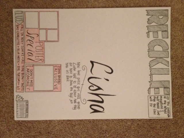
The first person that I interviewed stated that she liked the magazine and suggested that the colour scheme I use is dark purple and black, as these are obvious choices that will appeal to a rock music audience, as they are stereotyped to like dark colours. She said that she thinks the name of the magazine is appropriate, and the pages look like they belong to the same magazine. She said that there were enough stories on the front page and that she had no further comments. I have gained quite a bit of information from this interviewee about the front cover of my magazine.
The next interviewee said that she liked the name of the magazine, and gave information to how much money she would be willing to pay, she said she would pay £2 so keeping this in mind I made sure that when drawing out my magazine I would make the price at £2. She said that she thought there were enough stories and interests on the front cover, like the previous interviewee and that she liked the colour scheme I told her I was going to create for it. She then said that she had no further comments "It's just good" which was a nice little comment for her to make.
The last person that I interviewed said that the colour scheme she thought was the most appropriate for the music magazine was red, blue and black, to which I agreed with her and made the necessary changes on the music magazine drafts. She then said that she liked the style of the magazine and that she thought that the name of the magazine was appropriate to its audience and that the house style was present throughout, she then said that she had no other comments.

From these interviews I have gathered the information that the colour scheme should be dark colours, with an obvious choice of black within there somewhere, that the price of the magazine should be around £2 as it is going to be a weekly magazine and therefore should not be too much money as my target audience is young women, therefore they will not be on a high salary. I also learned that my audience liked the look of my magazine so I should keep the style something like the drafts in the creation of the actual magazine.

Research and Planning: Audience Interview Questions

Audience Interview Questions

1. What Colour Scheme do you think I should use for my Rock Magazine?
2. Do you like the style?
3. Do you think the name of the magazine is appropriate?
4. Do the pages follow the House Style?
5. Do you think there are enough stories?
6. Do you have any other comments?

Friday 19 October 2012

Research and Planning: Podcast #1

Research and Planning: Questionnaire

Today I created a quick eight question Questionnaire to help me in the production of my Music Magazine. The questions that I asked were:
  • Are you Male or Female?
  • How old are you?
  • What genre of music do you listen to?
  • Do you read any music magazines? (if so please state)
  • What colours would you associate with a Rock Magazine?
  • Would you prefer a Band or Solo artist on the cover?
  • Do you think 'Reckless' is a good name for a Rock Magazine?
  • How much would you pay for a Music Magazine?
I think that these eight questions are very good for finding out what my audience likes and what they want to see in my magazine.

Tuesday 9 October 2012

Research and Planning: Collage


Research and Planning: Masthead Design

Please see below for Audience Feedback.

Research and Planning: Second Magazine Cover Analysis


The second Music Magazine that I have decided to annotate and look at is a magazine called "Rock Sound". First off we see that the Masthead is clearly saying "Rock" which bluntly tells it's audience that the magazine has 'Rock Sound' inside. This makes it easier for it's audience to find out what type of music will be inside so that people who do not like Rock won't even touch it. The second thing that I have noticed is the Main Image of a band called 'Madina Lake' the front man Nathan Leone is doing a very conventional hand gesture which most people will associate with Rock music, this also makes it very simple to the audience what type of music will be in this magazine, it also gives it a kind of classic take as not many people actually do that hand gesture anymore, also it is almost as if the hand is coming out towards us, because it is arranged above some of the cover-lines, this gives the cover a more interesting look and makes the audience want to see. The main image is a Medium-Close up shot as it is from the waist up. The magazine sticks to the three colour rule using Yellow, Red and White as its only main colours, this makes the magazine not too crowded by colour and the colours they have used compliment each other and the main image.

Monday 8 October 2012

Research and Planning: Double Page Spread Analysis

The next thing about Music Magazines I will be looking at is a Double page Spread of Rock Magazine Kerrang!, I chose this Magazine because it is the same genre as my own Magazine so by analysing this it will help in the production of my own Magazine. The first thing that I notice about the spread is the colour scheme again is a lot of red, black and white which is the same colour scheme that I was thinking to use on my own Magazine as these colours are very conventional of Rock Magazines. The next thing that I like about the spread is the main image is of the lead vocalist, Gerard Way, of the band 'My Chemical Romance' or 'MCR'. The image is in black and white which I think fits with the colours on the spread and makes it quite dark, which is also conventional of Rock. The one thing that I do not like is that the interview is actually quite short and there is not much text to it, on the creation of my own Rock Magazine I will make sure that the interview will be plentiful and not too short.

Research and Planning: Contents Page Analysis

For my Contents Page Analysis I decided to analyse Rock Sound Magazine's Contents as for the Cover Page I analysed Kerrang! Magazine, I thought I would do something different.The first thing I notice about this Contents page is that all the colours compliment each other very nicely and make the page look appealing. The next thing that appeals to me is that for the band interviews, they have used pictures of them on the right hand side and put the page number underneath as to which page the interview will be on. I think that the overall layout of the text is very neat and well thought out, putting each different story in the appropriate section, I think that doing this is a very good idea as it makes the page neater and helps the audience to find which story they want to read. I like how all of the fonts tie in nicely with the genre of the Magazine, which we can tell here with the colours etc is Rock Music, as they are distorted and Rock-y looking. This also will tie in with the Cover Page, as Rock Sound always has the same Masthead, which is a distorted Rock look.

Research and Planning: Music Magazines Analysis


The first music magazine that I decided to annotate was a very popular rock/metal/alternative magazine Kerrang!. The first thing that I notice about the magazine is the Masthead, it is very conventional to the genre of the magazine as it is bold, very noticeable and has cracks in it as if it is a smashed mirror. This is conventional as people see Rock and Metal music as very heavy and 'scary' whereas the people who listen to it really enjoy it. The second thing I notice is that the Main Image is always very upfront, they are always looking straight down the lens of the camera, I think that this makes the reader know that the magazine is serious and a rock magazine. The camera angle that they use the most often is a mid-shot, we hardly ever see the person's feet. If the magazine was a pop magazine then I think the Main Image would have been more happy and jokey, maybe showing more of their body as clothing is more important in Pop Magazines than Rock Magazines. On these front covers, both images are wearing black, and dark colours and not much of the clothes are showing, as the cover lines are more important on these magazines. The two magazine covers that I chose seem to both stick to the Three Colour scheme, only using White, Red and Black. This is a good strategy as using too much colour can make the magazine seem over-loaded and too much to look at.