
Thursday 27 December 2012
Friday 14 December 2012


Wednesday 12 December 2012
Research and Planning: Serif Fonts

For the task today, in class we did a discussion about what fonts are appropriate and which ones should be forbidden when writing a double page spread for a magazine. We discussed the difference between Serif Fonts and Sans-serif Fonts. It is morally said that Serif Fonts should be used in the creation of double page spread, this is because of the small flicks at the end and corners of the letters, this will make the type more eligible and will stop confusion between the letters. For example, if using a Sans-serif Font, sometimes the letters can look the same so the reader might be confused by the I and the l, but because of the flicks in the appropriate places it will tell the reader which letter it is meant to be and the flow of the reading will not be stopped.
Sunday 9 December 2012
Research and Planning: Make-Up Idea #1
This is a simple technique, but I decided to consider it as it is being used a lot recently. It is a very rock technique which we see being used by the likes of Hayley Williams (front woman of rock band Paramore) and Seirra Kusterbeck (front woman of VersaEmerge), who are influential as woman in the rock industry at the moment.


Friday 7 December 2012
Research and Planning: Magazine Update #1
What have I yet to do?
- I need to finish the creation of my Magazine, of course. The cover is nearly finished except for the lack of photographs that are on it, therefore I will be needing to take my photographs as soon as possible.
- I have also began the production of my Contents page, in which I will be needing many different pictures of different things, this is important so as to make it look like a real Rock magazine, as there would be many pictures.
- I also need to begin the production of my Double Page spread.
- I need to write the article for my Double Page spread, which is vital in the production.

Wednesday 5 December 2012

Friday 30 November 2012

Wednesday 28 November 2012

Research and Planning: Colour Scheme Research
 I have been thinking a lot about the cover of my Magazine and the colour scheme. Originally I was going to do Red, White and Black, as these are the most conventional Rock Magazine colours and also these are the most popular colours that were requested by my audience. However, after much consideration I have decided to actually go against my audience feedback and give them something new to look at. I'm going to take the more creative route and go out of conventions, instead of red I will be using blue. This is not too much out of the ordinary as I have found some examples of instances in which Kerrang! Magazine have also gone out of the convention and used blue. I think that it still looks like a Rock Magazine, which is what I want, I also think that it will attract more attention because doing Black, White and Red people might just think its 'just another Rock Magazine'

Friday 23 November 2012

Research and Planning: Band Font
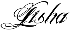
This is the font that I will be using on the front cover as the band's Logo. I think that it is conventional to the genre of magazine that I am doing, even though it is calligraphy and calligraphy is seen as decorative and attractive. There are many Rock bands nowadays with 'pretty' fonts as their logo, so by following this it will make my Magazine look more realistic.

As you can see, there are many rock bands out there with very swirly and calligraphic logos, therefore I will also follow this pattern with my band.
Research and Planning: Extra Cover Page Research


Another thing that I have noticed about a lot of popular Rock/Alternative Magazines is that instead of loading the front cover with the whole band, they will just have the lead singer on the front cover and then inside on the double page spread interview you will be able to see the whole band. I think this is a much tidier and nicer way of doing it, overall making the magazine look much better. Also, because I will be doing my magazine in a 'Kerrang' style, there will be a lot of text and other pictures of different bands, therefore there will be a lot going on, on the page anyway, that way the magazine will not look boring.

Research and Planning: Fonts Research


Friday 16 November 2012


Research and Planning: Double Page Spread Development

Here we see the My Chemical Romance interview from the Music Magazine Kerrang!. I chose to base my own music magazine around this one because I really like the layout and I like the little snippet of Album Review that they have also thrown in there. I also like the fact that there are quite a few pictures on the page, it makes it more interesting instead of just having that one main focus image. The format that I will be doing in my own magazine double page spread is a story about the band on my front cover, however with quotes from the band as if I'm actually with them and talking to them. I decided this format instead of an interview questions format because with the questions you don't get much about the actual band. I also want to take inspiration from this Kerrang! Magazine and, as I drew in my Double Page spread draft, do the small album review down the right hand side of the page. I think this gives it a bit of an edge, and if I were reading a magazine I would like having the diversity of being able to read a story about the band and an interview on the album.
Research and Planning: Double Page Spread Research
 |
| The first Double Page spread is taken from the music magazine Kerrang!. It is an interview with the band My Chemical Romance, however they are not asking them questions, they are just talking about the band and what they have been up to. They have also done a small album review down the right hand side, reviewing just a few of the songs from their upcoming album and what to look out for. |
 |
| The next Double Page spread that I looked at, was a section in a music magazine called "Radar", we can tell that this is an interview with a just starting out band, who they are, what music they play, and then on the right hand side are examples of other bands, kind of like "if you like 'The Teenagers' then you'll like these" |
 |
| The next Double Page spread that I looked at was a very simple one. The picture is basically taking up the whole thing and the text is very small, with only one large caption 'Gentlemen of the Road'. This Double Page spread looks like the beginning page to a larger interview with the band, so the interview with this particular band is taking up more than just two pages. |
 |
| After, I found a Double Page spread Gig Review from the magazine Kerrang!. Here we see Kerrang! going to a 'While She Sleeps' gig, rating it out of five 'K's and talking about the main focuses of the gig, if they enjoyed it and recommending you to go and see them in concert too. |
 |
| This Double Page spread from the magazine Kerrang! is a strange one, and obviously a limited edition and is that weeks Kerrang!'s featured content. It is kind of a small review on 20 of the 'Greatest Rockstars EVER!', numbering each 'Rockstar' in who they think is the best. |
 |
| This Double Page spread is in the 'News' section of the Kerrang! Magazine and it is showing a short actual interview where Kerrang! is asking the frontman of AFI questions. This is different from any other interview in the Kerrang! Magazine as they normally just talk about the band, not too the band. |
 |
| The last Double Page spread that I have looked at is from the music magazine 'Q'. It shows the rock band Greenday talking about their favourite albums that they listen to and why. This is a nice double page spread as on the left hand side we get a small interview with the band and then on the right hand side is the featured content from Greenday, with small pictures of each of their 'influential' bands. |
Wednesday 14 November 2012
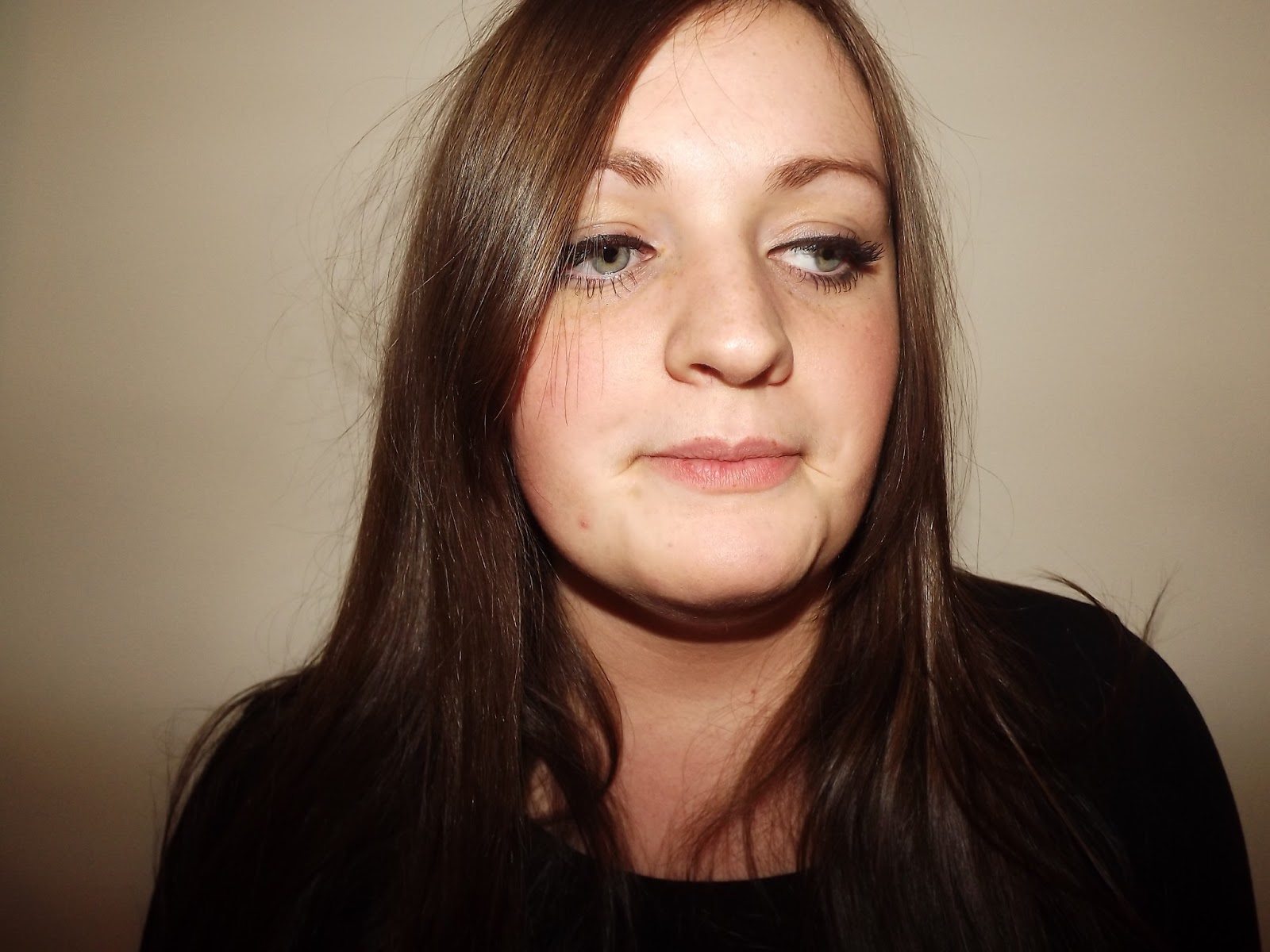
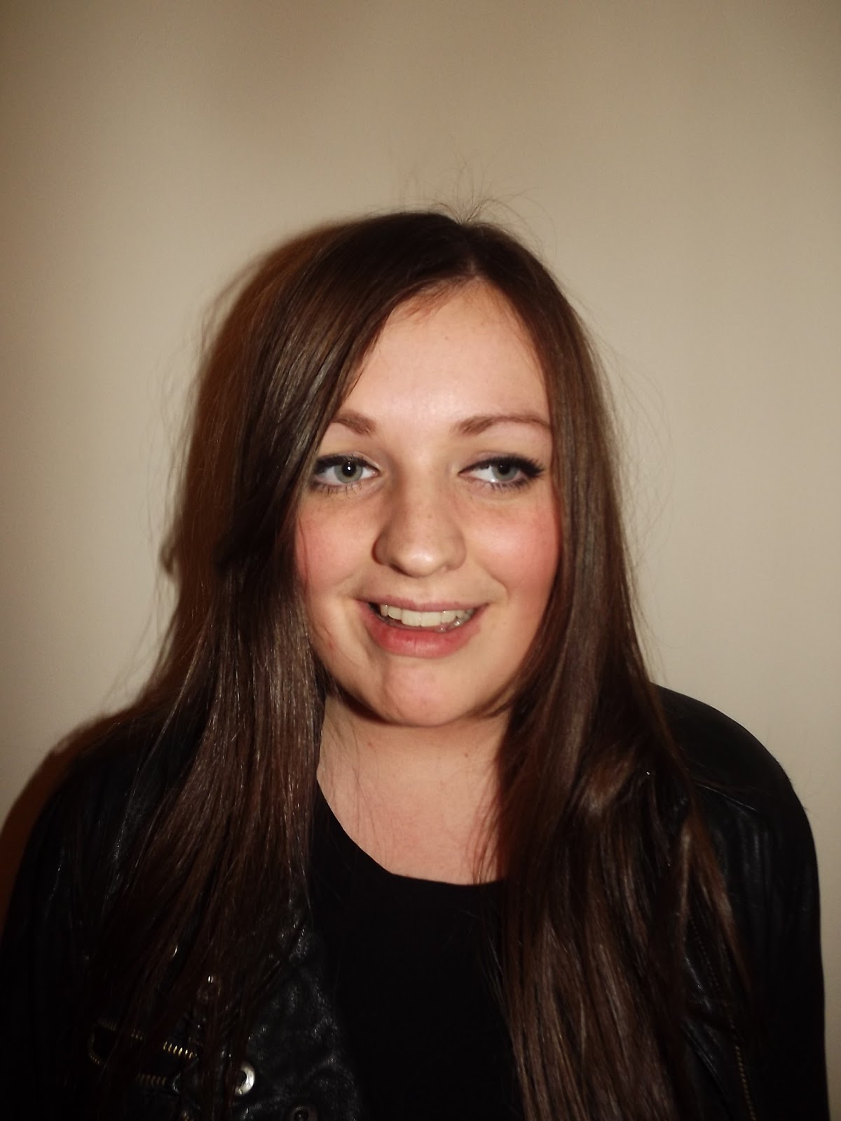
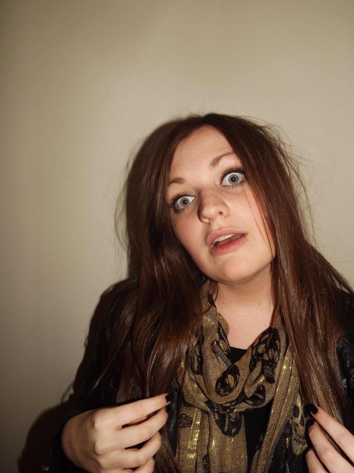
Research and Planning: All Elisha Model Photos


 |
| I really wanted to use this photograph on the front of my magazine at first, but as the photograph is quite close it cuts off part of her head, making her unable to fit on the magazine without being too close. |


 |
| This is the photograph that was used on the front of my magazine. |


 |

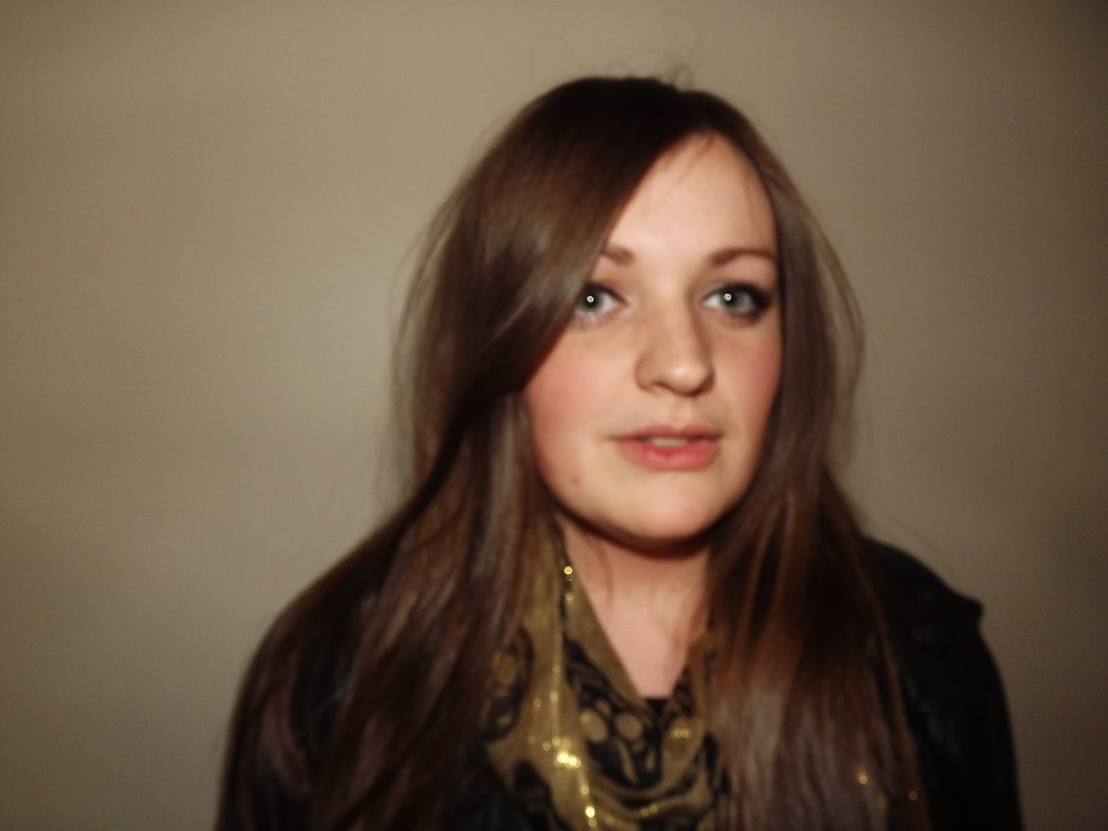
There were a lot of photos taken on this photoshoot with my model Elisha. I will not be able annotate every one as there is a lot of photographs. I tried hard to get a good lighting and the plain background at the back is my cream bedroom wall as Elisha could not get to Hyde Clarendon to use the proper photo booth.
Subscribe to:
Posts (Atom)