Friday, 30 November 2012
Wednesday, 28 November 2012
Research and Planning: Colour Scheme Research
 I have been thinking a lot about the cover of my Magazine and the colour scheme. Originally I was going to do Red, White and Black, as these are the most conventional Rock Magazine colours and also these are the most popular colours that were requested by my audience. However, after much consideration I have decided to actually go against my audience feedback and give them something new to look at. I'm going to take the more creative route and go out of conventions, instead of red I will be using blue. This is not too much out of the ordinary as I have found some examples of instances in which Kerrang! Magazine have also gone out of the convention and used blue. I think that it still looks like a Rock Magazine, which is what I want, I also think that it will attract more attention because doing Black, White and Red people might just think its 'just another Rock Magazine'
Friday, 23 November 2012
Research and Planning: Band Font
This is the font that I will be using on the front cover as the band's Logo. I think that it is conventional to the genre of magazine that I am doing, even though it is calligraphy and calligraphy is seen as decorative and attractive. There are many Rock bands nowadays with 'pretty' fonts as their logo, so by following this it will make my Magazine look more realistic.
Here is one example from a band named Madina Lake.
Here is another example from a rock band called Parkway Drive.
Example number three is from an alternative band called Panic! At the Disco.
As you can see, there are many rock bands out there with very swirly and calligraphic logos, therefore I will also follow this pattern with my band.
Research and Planning: Extra Cover Page Research
Another thing that I have noticed about a lot of popular Rock/Alternative Magazines is that instead of loading the front cover with the whole band, they will just have the lead singer on the front cover and then inside on the double page spread interview you will be able to see the whole band. I think this is a much tidier and nicer way of doing it, overall making the magazine look much better. Also, because I will be doing my magazine in a 'Kerrang' style, there will be a lot of text and other pictures of different bands, therefore there will be a lot going on, on the page anyway, that way the magazine will not look boring.
Research and Planning: Fonts Research
As you can see, Kerrang! Magazine uses a maximum of around three fonts, their Masthead (Kerrang!) which is all broken up looking which fits the conventions of the magazine, their normal font which is for the coverlines, what's going to be in the magazine, etc. And then they use the band's font who is on the front cover, their logo. For my Magazine, I will be matching this style that Kerrang! is following, and I will have to create a logo for the band 'Lisha' that I am using. I do not want to use too many different fonts because I do not want to overload the cover, I want it to look good.
Friday, 16 November 2012
Research and Planning: Double Page Spread Development
Here we see the My Chemical Romance interview from the Music Magazine Kerrang!. I chose to base my own music magazine around this one because I really like the layout and I like the little snippet of Album Review that they have also thrown in there. I also like the fact that there are quite a few pictures on the page, it makes it more interesting instead of just having that one main focus image. The format that I will be doing in my own magazine double page spread is a story about the band on my front cover, however with quotes from the band as if I'm actually with them and talking to them. I decided this format instead of an interview questions format because with the questions you don't get much about the actual band. I also want to take inspiration from this Kerrang! Magazine and, as I drew in my Double Page spread draft, do the small album review down the right hand side of the page. I think this gives it a bit of an edge, and if I were reading a magazine I would like having the diversity of being able to read a story about the band and an interview on the album.
Research and Planning: Double Page Spread Research
Wednesday, 14 November 2012
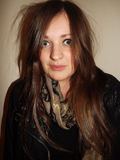
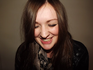
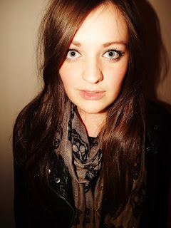
Research and Planning: All Elisha Model Photos
 |
| This is the photograph that was used on the front of my magazine. |
 |
There were a lot of photos taken on this photoshoot with my model Elisha. I will not be able annotate every one as there is a lot of photographs. I tried hard to get a good lighting and the plain background at the back is my cream bedroom wall as Elisha could not get to Hyde Clarendon to use the proper photo booth.
Subscribe to:
Comments (Atom)


